Wondrous Web Trends to Look Forward to in 2016

It’s 2016, is your website ready to meet the future? Here are three web design trends for the new year and the reasons why they’re not just flash in the pan fads but essential tips for success.
Web users know how to scroll. And like it. Really.
While web visitors still like to scan content, they’re here to read. For mobile devices, it’s much more pleasant to read one long page with a quick flick of the finger than to sit and wait for shorter, additional pages to load.
The facts behind this trend:
The “fold” as a usability principle is a myth* — user testing, eye tracking and click data all prove that users will scroll to engage with content on a page. On average, over 65% of user engagement happens below the fold! Be careful, though, if you’re obscuring your fold with ads, that’s a quick way to turn readers off to your content.

Tips on implementing this trend:
The best practice is to ensure that users recognize when a fold exists and that content extends below it, rather than trying to cram as much as possible above it. (Even the fold itself has become an arbitrary measurement due to the sheer variety of device screen dimensions. So, stop worrying about it and focus on employing compelling content!)
Assume your visitors are going to read what you have to say, simply provide them with helpful calls to action along the way. While they are inclined to scroll down your page to read, they won’t be as keen to scroll back up. Give your customers a little incentive to delve deeper into your site or visit a conversion page, such as a contact form.

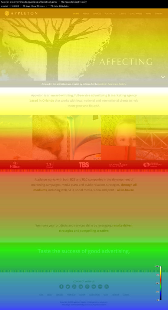
Also, be sure the scrolling behavior of your users isn’t lost data! Just as you should be analyzing which pages in your site perform the best, you should similarly know which parts of a page are your #1 sources of conversion. Here’s an example of a “scroll map” for Appleton’s own website:

Think of how you can cater to your clientele once you know what content they think is important. Read with an understanding of its meaning, this heat map, and the tools it possesses, show which content on your site people see most and how they prioritize their time.
Pretty cool, huh? If you’d like to start receiving data like this for your own website, give us a ring!
*The fold is a term that originally used to refer to the upper half of a newspaper page. In modern terms, it has come to mean the part of a webpage that is visible without scrolling.
Hero videos tell an ever bigger story.
If a picture is worth a thousand words, it’s a no brainer that companies are seeking to communicate even more information (around 1.8 million words if you wanna do the math) via homepage videos. Higher bandwidth and video-friendly mobile devices have made it technically seamless to serve up smooth-playing video on a website. It gets even better.
The facts behind this trend:
Let’s skip the stats that tell us how many people are watching online videos, you know it’s a lot. We’re here to tell you it isn’t all funny cat videos:
- 75% of executives told Forbes that they watch work-related videos on business websites at least once a week.
- 90% of online shoppers at a major retailer’s website said they find video helpful in making shopping and buying decisions.
- This is also true for “big” sales like real estate. An Australian real estate group reports that listings with videos receive 403% more conversions than those without videos.
- Visitors who view videos stay on a website an average of 2 minutes longer than those who don’t view videos.
Video converts!
Tips on implementing this trend:
You’ve got about 10 seconds to grab your viewers’ attention. While that may not seem like much, you’ve still got a lot of time to make a great impression — desktop viewers tend to stick with videos for up to 2 minutes, with mobile viewers around for a bit longer. Two minutes is plenty of time to get across your marketing message, trust us, and knowing that viewers tend to peak around this time also means you don’t need to waste money shooting longer video!
Be smart with your video and attach analytics. Just as it’s important to frequently assess the performance of your website, you’ll want to review your video content. Make sure your hosting service collects quality stats, such as engagement. Here’s a peek at some of the stats Appleton Creative collects on our videos:

One more tip for video: while it looks beautiful on your website and is an excellent conversion tool, remember that video works well other places! (Stats from Video Brewery.)
- Email. Including a video screencap in an introductory email increases the click-through rate by up to 96% and reduces the number of subscriber opt-outs by up to 75%.
- Social media. Those executives in our previous statistic also like to watch videos on YouTube or Facebook. Sixty-five percent of them visit a company’s website after viewing a video.
- Ads. Eighty percent of Internet users recall watching a video ad in the past 30 days. Of that 80%, 46% took some action after viewing the ad:
- Twenty-six percent researched more information about the product or service.
- Twenty-two percent visited the website named in the ad.
- Twelve percent purchased the specific product or service featured in the ad.
Video opens up a wide world of possibilities. Let us help you decide the best strategy for your website.
The “hamburger” is telling us how visitors are sating their hunger for information.
Have you noticed this little icon replacing navigation more and more on websites, even desktop versions? We affectionately refer to this icon as the “hamburger.” But aside from being a symbol for one of America’s favorite foods, it’s also a sign of the mobile revolution.

The facts behind this trend:
The hamburger has become the defacto menu icon on mobile devices. The symbol originated as a “container” for contextual menu choices and was designed to mimic the look of the resulting displayed menu list (Gizmodo). It’s so pervasive that web agencies are starting to experiment using it as the primary navigation tool for desktop sites!
Smart phones and tablets have become ubiquitous in our culture. But, did you know that clicks on mobile devices are overtaking the desktop and even TV? Here’s a look at some of the numbers:
- During Thanksgiving 2014, mobile traffic exceeded PC Internet traffic for the first time: 52.1% mobile vs. 47.9% desktop (IBM).
- In the third quarter of 2014, users spent more time on mobile devices than watching TV for the first time.
- Time spent on mobile devices in the U.S. increased 9.3% from the previous year and was recorded at 2 hours and 57 minutes per day, while TV stayed flat at 2 hours and 48 minutes (Flurry).
Tips on implementing this trend:
You might have heard about “responsive web design,” in which a website is designed and programmed to adapt to the width of a device’s screen. That means a single website will look and work great on everything from a small iPhone to a large cinema display. But the philosophy of good web design isn’t just about the technology, it’s also important to adopt a creative mindset that meets the demands of a modern audience. And that means going with a “mobile first” strategy.

Don’t fall into the trap of treating your mobile users as a secondary audience lacking an attention span; they’re now your primary audience and a lot more likely to engage fully with your content than desktop users. Give your mobile audience a content-rich website with interactions that make sense — scroll, swipe and pinch/zoom — and media that is optimized for their devices, HTML5 instead of flash, for example. Above all else, don’t position your mobile website as a “lesser” version of the desktop site. If anything, it should be the first device that is mocked up and planned for.
Responsive design, simply put, is modern web design. Don’t waste time and resources on a mobile-only website that will actually turn away your visitors. Focus on developing a beautiful website that meets the needs of today’s audience.
A beautiful website with amazing video can be yours. Appleton Creative is an award-winning, full-service advertising agency that specializes in Orlando web design, video and print services. Appleton works with local, national and international clients to deliver powerful, responsive websites that are specifically designed to be seen first in search engines. Reach your target customers in the right places and establish highly qualified leads with a dynamic and accessible website. Your web design and development goals are worth a conversation: contact us at 407-246-0092 or info@appletoncreative.com.


