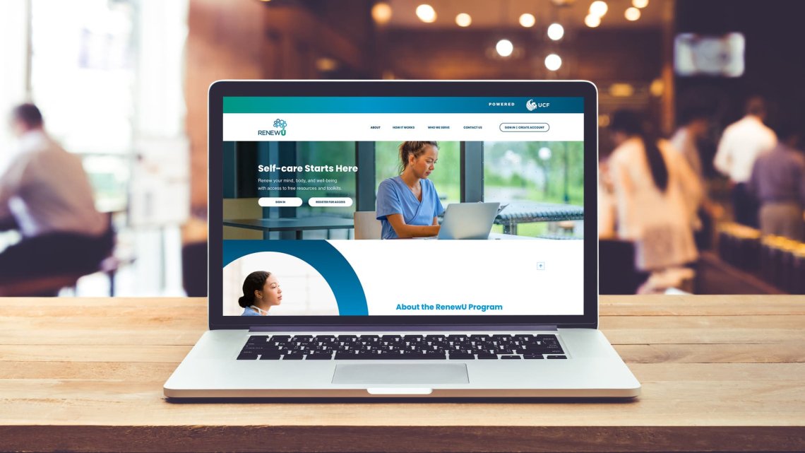
UCF College of Medicine and Appleton Partner to Provide Continuing Medical Education with the Launch of RenewU

What is RenewU?
Powered by the University of Central Florida (UCF) College of Medicine, RenewU is a free toolkit aimed at fostering wellness and resilience for individuals, teams and organizations in the medical sector. In 2022, RenewU research found 69% of healthcare professionals and 79% of students reporting significant stress; the initiative was created to address this growing concern. With resources from experts in the fields of counseling, medicine, nursing, physical therapy, psychology, social work and trauma-informed yoga, it serves as a comprehensive resource for those in related fields to take care of their minds and bodies. Resources are offered through RenewU’s free online portal, which provides both accredited and non-accredited courses to support the annual continuing medical education requirements for healthcare professionals.
Building RenewU’s Brand Identity
At the heart of RenewU lies a carefully crafted brand identity. Considering how impactful and necessary the initiative is, we took a detailed approach to ensure its branding was attention-grabbing, welcoming and representative of core values. The goal was to develop a presence that captures RenewU’s essence: helping the mind, body and spirit of its users.
How to Develop a Brand Name
The foundation of the brand was established by developing a name that would captivate the various target audiences’ attention, while simultaneously communicating exactly what the toolkit does for its users.
Through Appleton’s creative process, we facilitated a strategic branding session with the RenewU team to gather key information from the project’s stakeholders. Through a post-session analysis, an evaluation of multiple variables was conducted:
- Research and strategic positioning
- The core principles of what the program does and why it exists
- Keywords identified in the branding session and subsequent meetings
- Competitive analysis of existing names in-market
In conjunction with the analysis of these components, the inspiration for the RenewU brand name was derived from the need to offer empowerment and equip users of the toolkit with a sense of wellness, stability and self-awareness. The goal of the toolkit is to ensure its users have the tools to handle life well, no matter the stressors they may encounter in their professional environments.
To achieve this state of well-being, one must visit a place that regenerates the mind, revives the soul and restores their mental well-being through a variety of resources. In essence, they need to experience a process of renewal to overcome their anxieties and stresses to help return back to the desired state of wellness.
Thus, this continuing medical education program was born to “RenewU.”
Paying homage to its educational roots, the “U” at the end of the brand name takes a homonymous approach to represent a renewal of the self while also indicating a university-like platform to help users grow.
Establishing a Visual Identity
Since we had the privilege of being involved in the program’s earliest stages, Appleton designed a logo representative of RenewU’s mission. Through extensive research, brainstorming sessions and constant unified collaboration, we refined the program’s ethos into a visual language that speaks to its purpose. The final product is shown below. 
The logo features thoughtfully selected fonts, colors and symbolic elements used across all brand touchpoints to maintain consistency. Typography plays a role in conveying the brand’s personality, which is why we chose a modern, sans-serif typeface that embodies professional expertise. The color palette was picked similarly, with blues and teals symbolizing credibility and mirroring calming colors most commonly used in the healthcare and mental wellness arenas. The logo also symbolizes the program’s values of growth and resilience. The circles forming the shape of a brain demonstrate the transformation users can go through on their self-care journeys with RenewU interventions, with the varying sizes representing individuals, teams and organizations. Intentional design and strategic execution guided the RenewU logo to be the first visual branding step of the initiative’s goal of making a lasting impact on the medical sector.
Designing + Developing RenewU’s Website
RenewU’s 10 evidence-based interventions for preventing burnout and promoting resilience are the primary resources offered by the program. There are two types of interventions, one for the mind and the other for the body, which are all tailored to the needs of individuals, teams, students and organizations in the healthcare field. To execute its mission, the RenewU team needed somewhere to house these modules and make them easily accessible to the appropriate audiences. In addition to informing users of RenewU’s purpose, the website we created with our unique process serves to do exactly this.
The website offers various features made possible by our team of full-stack developers and custom web templates:
- User-centric design: The website was designed with the end-user in mind. Each element aims to serve individuals, teams, students and organizations in the medical sector, ultimately allowing for a seamless, intuitive website experience for all users.
- Intuitive navigation + user experience: It was crucial for the RenewU website to enable visitors to easily find and engage with the content available to them. This was achieved through an intuitive navigation menu, clean layouts and clear calls-to-action that ultimately encourage users to keep exploring.
- Mobile responsiveness + accessibility: Making websites that are functional across all screen sizes and devices is non-negotiable for Appleton. By employing responsive design principles and accessibility best practices, which were confirmed through responsive testing, the website is accessible to all users regardless of the device they’re using.
- Informative content: Considering RenewU is an entirely new initiative, the content included on the website needed to be compelling and informative. In addition to the interventions, the website contains information that communicates RenewU’s purpose and empowers visitors to participate in the program. From background information to interactive tools and resources, the website offers a wealth of valuable content designed to engage and inform its audience.
- Brand consistency: The RenewU website is an extension of the brand identity we established for the program. Typography, color palettes, and symbolic elements consistent with the RenewU logo were incorporated into the site to foster a cohesive brand experience.
- Robust member portal: The star of this site is the RenewU member portal, where users can access the program’s interventions and track their progress. Our team knew there needed to be a quick and easy way for users to access RenewU’s main offerings, which we addressed with the portal. It serves as a hub of resources and interventions medical professionals can utilize to foster well-being within themselves or among their peers.
Through deliberate website development and design, we’ve created a digital platform that showcases the essence of RenewU and serves as a catalyst for positive change in the healthcare industry. With its intuitive user experience and resourceful content, the RenewU website is poised to help the mind, body and spirit of its users. You can see these features and more at work here, on the official RenewU website.
Are you looking to start an initiative from the ground up? We can help you make an impact. Appleton is an award-winning, full-service Orlando advertising agency that works with local, national and international clients to deliver impressive ad campaigns, branding, print, web, public relations, social media and video services — all in-house. At Appleton, we want to learn about your business, empower your marketing team and be your creative resource. Your advertising goals are worth a conversation: contact us at 407-537-6352 or info@appletoncreative.com.


