Top Five Reasons to Adopt Responsive Website Design (That Aren’t Just About Mobile Phones)

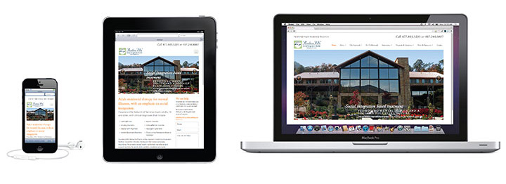
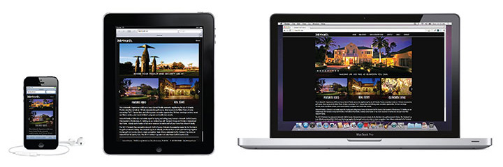
Responsive web design is the practice of developing a single website that reflows its layout and content based on the visitor’s device. Responsive design means that whether you’re using a desktop computer, tablet or smartphone, mouse clicks or finger taps, you’re presented with a website that is beautiful, user-friendly and optimized specifically for your browsing experience.
It’s a tactic that we’ve embraced fully at Appleton Creative. But every now and then, we hear this phrase:
“Our customers don’t use mobile phones to view our website.”
This isn’t the first time we’ve heard this comment from a potential client. Usually, a look at their website’s analytics is enough to persuade them to consider upgrading to a responsive web design – most of the sites we’ve developed and managed have at least 25% of their traffic coming from smartphones and tablets, and it’s only growing.
Believe it or not, existing mobile traffic on your website is only one reason to go responsive. Here are our top five calls to action to embrace responsive website design:
1) Ensure your website matches your brand and customer expectations.
A responsive redesign is a great time to bring the look and feel of a potentially old website up to speed with the rest of your marketing. As an added benefit, it’s also an opportunity to improve the overall aesthetics and usability of the website itself. Strategies for responsive website development carefully consider everything from animation effects to ease-of-navigation, and the design process can unveil new opportunities to appeal to your customers.
After all, brand is not just about how something looks, but also how it works; if your customers are expecting a mobile-optimized, responsive website that can still serve up animations and video, but find an inaccessible desktop version with broken components, they are likely to think less of your brand and not return.
2) Stop settling for the “lowest common denominator.”
A previous strategy for web development was to create a design that works on the “lowest common denominator.” This was usually older computers that could only manage an 800×600 or 1024×768 resolution (today we operate at 1366×768) and a limited color palette. As computer monitors have evolved into high-definition, wide screen displays, website owners are faced with a dilemma: do they keep a “small,” unsophisticated website design to accommodate what could still be a significant amount of traffic from customers with old computers? Or do they upgrade their design to look beautiful on modern displays?
To these owners, we say, “you can have it both ways!” Responsive websites aren’t just about mobile devices – they can allow you to both present a layout for today’s large desktop screens and accommodate laptops and old desktop monitors that don’t have a high resolution.
3) Build for the future.
One of the advantages of responsive design is that it doesn’t focus merely on today’s devices. It can be daunting to see the sheer amount of new smart phones and tablets hitting the market and wonder if you’re making a good impression on all of your mobile customers. But because a responsive website reflows to fit a screen of any size, with an experience and a layout suited to each, the approach is very future-friendly. What if Apple announces a new iPad size at its next keynote? Congrats, your responsive website will already look beautiful on it!
4) Increase your mobile traffic.
Is your website meeting its full potential for mobile traffic? A recent Google survey of mobile users found that 72 percent of mobile users say it’s important to them that websites are mobile-friendly, so it comes as no surprise that Google consider responsive web design as a “best practice” and weights search engine optimization (SEO) in favor of such sites. If your website does not support mobile devices, a mobile visitor will likely leave immediately and never return. But if your website no longer turns mobile users away, the users in turn will not leave as soon as they arrive, might visit again, and even point other people to your content. Mobile support encourages mobile use.
5) Save time and money during your redesign.
Many clients come to us with a pre-existing need for a website redesign and ask if we can add the responsive code at a later phase, after the new website goes live. Unfortunately, responsive web design isn’t like a WordPress plugin that can be added at any time with little fuss – it’s an integral part of the design process that begins with mockups and touches every part of a website’s code base. Converting a website to be responsive at a later date is on the scale of a complete redesign/rewrite, so it saves time and money to go responsive right out the gate.
In short, even if your current website doesn’t have a large amount of mobile traffic, a responsive design can actually increase your number of mobile customers, all while looking beautiful on everything from musty old CRT monitors to being future-proofed for devices we may not even know about yet.
Appleton Creative is an award-winning, full-service advertising agency located in Orlando, Florida. Appleton works with local, national and international clients to provide marketing strategies through print, web, social media and video production – all in house. At Appleton, we want to learn about your business, empower your marketing team and be your creative resource. Your marketing goals are worth a conversation: contact us at 407-246-0092 or info@appletoncreative.com.
Tags: responsive web design, website design, web design, web, web development, website


