Did Your Business Survive Google’s Mobilegeddon?

On April 21, 2015, Google tweaked its search engine algorithm to favor websites that it considered mobile-friendly, an event known as “Mobilegeddon.” This means that mobile-friendly websites will rank better than non-mobile-friendly websites. In February Google announced, “Starting April 21, we will be expanding our use of mobile-friendliness as a ranking signal. This change will affect mobile searches in all languages worldwide and will have a significant impact in our search results. Consequently, users will find it easier to get relevant, high quality search results that are optimized for their devices.”
In 2015, the average person spent 2.8 hours per day on their mobile device, in comparison to the 2.4 hours spent on their desktop or laptop.
In addition, Google mobile rankings identify in your search which websites are indeed mobile-friendly. This makes it easy for users to choose a mobile-friendly website over one that won’t look good or work optimally on their mobile devices. However, businesses still aren’t convinced of the impact Mobilegeddon had on their search engine rankings. Well, the results are in and these findings will change the way you think about your website.

What is a Mobile-Friendly Website?
Mobile-friendly websites display optimally on mobile devices, meaning users don’t have to pinch and zoom in order to clearly read the content and click the links. Rather, mobile-friendly websites are easy to read and operate on a smartphone and other mobile devices. Google acknowledges three types of mobile websites: responsive design, dynamic serving and separate URLs. Each of these methods can affect your site in different ways, but they all seek to obtain a favorable user experience for mobile viewers.
Mobilegeddon Results
Adobe tracked the traffic from 5,000 websites and divided them into mobile-friendly and non-mobile-friendly. The results were released in Adobe Digital Index (ADI)’s Q2 Digital Advertising Report, which concluded that organic traffic was 10% lower among sites with low mobile engagement.
Stone Temple Consulting, a digital marketing agency, studied more than 50,000 websites before the Mobilegeddon changes kicked in and one month in. The agency found that non-mobile-friendly websites fell in Google search rankings, while mobile-friendly sites increased their rankings. According to the study, 46.6% of non-mobile-friendly pages dropped in rankings. Compared to mobile-friendly pages, the difference is substantial with a 30.1% increase of mobile-friendly URL rankings. This accelerated the amount of businesses seeking professional website design and development agencies that offered responsive and mobile-friendly services.
Paid Mobile-Search Ads
Google’s search-ad system places ads based on the amount a website is willing to bid for a specified keyword, in addition to the quality of the website in which users are being led. Websites that received less organic traffic as a result of Mobilegeddon went on the defensive by buying Google’s mobile-search ads. In terms of Adobe’s study, this contributed to a 16% increase in the cost-per-click that Adobe clients paid for mobile-search ads when compared to the previous year. After Mobilegeddon, quality mobile-friendly websites that were paying for Google ads won more keyword bids and received more clicks.
Changes Over Time
Google stated before the changes took place that the roll out of the update could take days or weeks, which has made it harder for agencies, marketers and web operators to accurately measure the impact. Search results naturally fluctuate over time; therefore it’s hard to calculate what is normal and what isn’t over long periods. While the results may seem influential now, they may drastically change in a few months. That’s why your business needs to stay ahead of the curve with a mobile-friendly website that will put you ahead in the rankings.
Does Your Business Have a Mobile-Friendly Website?
If your website is not mobile-friendly, these findings should convince you to take action now. Waiting any longer could make your search engine results page (SERP) rankings even worse, especially over time. The first step is to decide what you want to do with your website, whether you want a full redesign or a mobile-friendly update. The second step is to hire expert website design and developers (like us!) to ensure it’s search engine optimized, mobile-friendly and it looks the way you want.
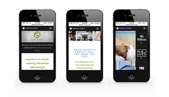
Don’t let your website scare mobile users away. Appleton Creative is an award-winning, full-service advertising agency that specializes in Orlando web design services. Appleton works with local, national and international clients to deliver powerful, responsive websites that are specifically designed to be seen first in search engines. Reach your target customers in the right places and establish highly qualified leads with a dynamic and accessible website. Your web design and development goals are worth a conversation: contact us at 407-246-0092 or info@appletoncreative.com.
Share on social media:


Copyright ©2026 Appleton Creative